Designing Pins for Pinterest Ads: Specs & Best Practices

Pinterest Creative — Recommended Pin Canvas
1000×1500
The 2:3 vertical pixel canvas Pinterest recommends for ad creative
Pinterest is a vertically-scrolled visual-discovery feed, and the canvas reflects it. A square asset cropped from a Meta campaign fills less of the mobile feed and earns fewer saves. Designing for Pinterest starts with rebuilding the creative vertical — not cropping a horizontal asset to fit.
Source: Pinterest Business, “Review ad specs” (standard image 2:3 / 1000×1500 px).
Designing Pins for Pinterest Ads: Creative Is Its Own Discipline
The single biggest mistake in Pinterest advertising is shipping the square Meta or Instagram asset unchanged. Pinterest is a vertically-scrolled visual-discovery feed, and the creative that performs is built for that surface from the first pixel. The recommended static ad ratio is 2:3 (1000 × 1500 px) — vertical, built to fill the mobile feed where the overwhelming majority of browsing happens (Pinterest, “Review ad specs”). Designing pins for Pinterest ads is a craft discipline, not a resize job.
Pinterest's own creative guidance frames the goal as making the ad feel like an idea, inspiration, or helpful suggestion — not a traditional ad. Soft lighting, clean composition, minimal clutter, and one clear idea per Pin (Pinterest, “Creative best practices”). The four creative levers that decide whether a Pin performs are the vertical canvas, the text overlay, the call-to-action, and — for video — the sound-off design and first-frame hook. This pillar covers all four in depth, with the exact specs a designer needs to ship a file that performs instead of one that merely looks finished.
This page owns the creative craft. For the full lineup of formats and when to pick each, see Pinterest ad formats. For catalog-generated creative that Pinterest builds from your product feed, see Pinterest shopping ads and catalogs. For AI-generated backgrounds and the deeper campaign-level fixes, see Pinterest ads optimization and AI. Because your call-to-action button should match your goal, line the creative up with your Pinterest campaign objectives from the start.
MB Adv Agency gives every designer the same first instruction: rebuild it vertical for Pinterest, do not crop it. The platform rewards native creative over repurposed creative, and that single decision — vertical-first, idea-led, legible on a muted feed — sets the ceiling on everything downstream. The sections below turn that principle into exact pin specs, text-overlay rules, CTA patterns, and sound-off video practices you can hand to a designer or check a file against before upload.
Pinterest Pin Design: Six Things That Decide Whether the Creative Performs
Most underperforming Pinterest creative fails for one of six reasons. Each point below is a declarative correction backed by Pinterest documentation or a named vendor source.
- Vertical 2:3 is the standard, not a preference. The recommended static ratio is 2:3 at 1000 × 1500 px. A square or landscape asset fills less of the mobile feed and earns fewer saves.
- Text overlay is a legibility problem before a copy problem. Short, high-contrast phrases that read at thumbnail size beat clever sentences nobody can decode on a muted feed.
- The CTA is now two layers. The Direct Links system button renders below the creative and cannot be disabled on eligible campaigns; the in-image phrase reinforces it rather than replacing it.
- Video is a sound-off, first-second medium. Front-load the hook into the first three seconds and design the whole clip to communicate muted, because the feed autoplays without audio.
- Keep overlay out of the bottom edge. The Direct Links CTA button occupies the area below the creative, so text crowded at the bottom competes with it.
- AI raises the floor, not the ceiling. Pinterest Performance+ generates backgrounds and variations for catalog ads, but the hook, overlay legibility, value proposition, and CTA match stay human decisions — the craft this page teaches.
The sections below turn each point into a spec table or a do-and-don't reference. For the format-by-format spec lineup, see Pinterest ad formats.
Pinterest Creative Specs: Key Numbers at a Glance
These are the load-bearing creative numbers for a visual-discovery brand. Every figure traces to a named source in the methodology section.
Recommended Pin Ratio
2:3
Vertical 1000 × 1500 px standard image — Pinterest “Review ad specs”
Video Sweet Spot
6–15s
Recommended video length; allowed 4 sec–15 min — Pinterest + Sprout Social
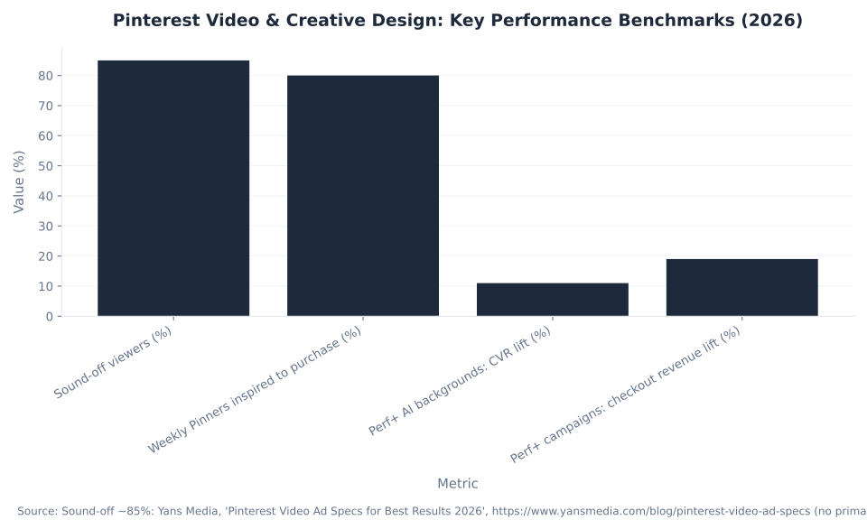
Sound-Off Viewing
~85%
Of video viewers watch muted (vendor estimate) — Yans Media 2026
On-Screen Text Contrast
4.5:1
Accessibility contrast ratio for legible overlay text — Sprout Social 2026
The vertical ratio and the sound-off reality are the two facts that reshape a Meta-trained creative process for Pinterest. The spec tables that follow give the full per-format detail.
Four Pinterest Creative Misconceptions — Corrected
These four beliefs are the most common errors in Pinterest creative tutorials. Each is a factual error with a declarative correction backed by Pinterest documentation or a named vendor source.
Misconception 1: A square or landscape image is fine for Pinterest ads
False. A square asset is allowed, but it is the wrong instinct. Pinterest's recommended static ad ratio is 2:3 (1000 × 1500 px) — vertical, built to fill the mobile feed (Pinterest, “Review ad specs”). Anything taller than 2:3 gets truncated in-feed, and square or horizontal creative occupies less screen and earns fewer saves (soona, “Pinterest ad size and specs 2026”). Designing for Pinterest means designing vertical-first, not cropping a Meta asset to fit. The square product photo that worked on Instagram starts at a structural disadvantage the moment it lands in a vertical feed.
Misconception 2: More text on the Pin means more information, which is better
False. The opposite holds. Pinterest's creative guidance is to keep overlay text minimal and legible — a short phrase at high contrast that reads at thumbnail size on a muted feed (Pinterest, “Creative best practices”). A crowded, text-heavy, sales-y image hurts both ad approval and performance. On-screen text should clear a 4.5:1 contrast ratio for legibility (Sprout Social, “Pinterest videos”). The job of an overlay is to land one idea instantly, not to explain the product. When the explanation needs a paragraph, the fix is a stronger visual, not more copy.
Misconception 3: You write the call-to-action into the image, and that is the CTA
False. Not anymore. On eligible Consideration, Conversion, and Catalog Sales campaigns, Direct Links are the default and cannot be disabled, and they render a system CTA button beneath the creative — defaulting to “Learn more” for standard ads and “Shop now” for shopping ads, with objective-matched options such as Add to cart, Sign up, and Get recipe (Pinterest, “Use direct links in your ads”). The in-image phrase is now a reinforcement of the button, not the whole CTA — and matching the button to the conversion event matters more than the wording baked into the picture.
Misconception 4: Pinterest video ads need great audio
False. Design for silence. Pinterest video autoplays muted in-feed, and the large majority of viewers never enable sound, so the message must carry through visuals and on-screen captions — a voiceover-dependent video fails to communicate (Sprout Social, “Pinterest videos”). Audio is a bonus layer, never the carrier of the message. Build the clip so a muted viewer understands it on the first pass, then treat sound as enhancement for the minority who turn it on.
Pinterest Ad Creative Specs by Ad Type
Table 1 is the load-bearing spec reference for the pillar. Each row maps one ad type to its recommended ratio, dimensions, file type, file-size ceiling, length or count, and character limits as listed on Pinterest, “Review ad specs”. Treat these as design inputs; for which format to pick, see Pinterest ad formats.
| Ad type | Aspect ratio (recommended) | Dimensions / file type | Max file size | Length / count | Title / description |
|---|---|---|---|---|---|
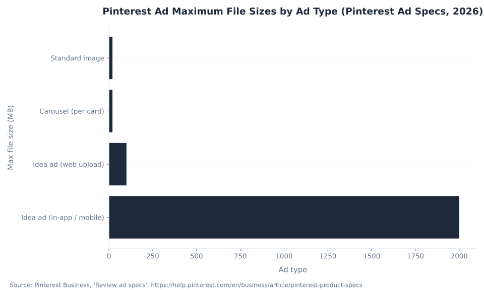
| Standard (image) | 2:3 (1000 × 1500 px) | PNG or JPEG | 20 MB desktop / 32 MB in-app | 1 image | Title ≤100 (first ~40 shown); desc ≤800 |
| Standard-width video | Square 1:1 or vertical 2:3 / 4:5 / 9:16 | MP4, MOV or M4V (H.264/H.265) | Up to 2 GB | 4 sec–15 min (6–15 sec) | Title ≤100; desc ≤800 |
| Max-width video | Square (1:1) or widescreen (16:9); cannot exceed a 1:1 height | MP4, MOV or M4V | Up to 2 GB | 4 sec–15 min (6–15 sec) | Title ≤100; desc ≤800 |
| Carousel | 1:1 or 2:3 | PNG or JPEG | 20 MB per card | 2–5 cards (each linkable) | Title ≤100; desc ≤800 |
| Idea ad | 9:16 (1080 × 1920 px) | Images: BMP/JPEG/PNG/TIFF/WEBP · Video: MP4/M4V/MOV | 2 GB mobile / 100 MB web | Multi-page; video ≤5 min/page | Title ≤100; overlay ≤250 |
Source: Pinterest Business, “Review ad specs” (ratios, dimensions, file types and sizes, video length 4 sec–15 min with 6–15 sec recommended, title ≤100 / desc ≤800, carousel 2–5 cards, Idea-ad 9:16 with a 250-character overlay cap), https://help.pinterest.com/en/business/article/pinterest-product-specs. Pinterest revises specs often; the Idea-ad safe zones run top 270 px / left 65 px / right 195 px / bottom 440 px.
Two cells in this table carry more weight than the rest. The 2:3 ratio for the standard image is the single decision that sets the creative ceiling, and the 250-character overlay cap on Idea ads is the one hard text limit Pinterest enforces at the format level. Everything else — file type, file size, title and description length — is a gate the file either clears or fails at upload. Confirm each cell against the live specs page before exporting, because Pinterest changes file-size ceilings and supported formats without notice.
Pinterest Pin Size: Dimensions and File-Size Limits
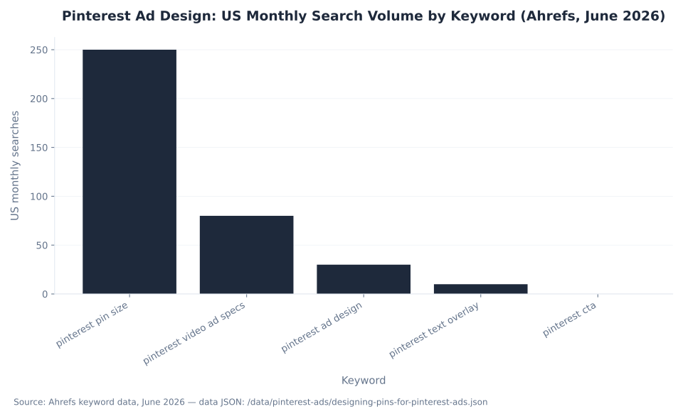
“Pinterest pin size” is the most-searched creative question in this cluster, and the answer is one number to anchor on: a 2:3 vertical canvas at 1000 × 1500 px for the standard image. Table 2 pulls the dimensions and file-size ceilings into a single quick-check reference for a designer about to export.
| Asset | Recommended ratio | Pixel dimensions | Max file size |
|---|---|---|---|
| Standard image | 2:3 | 1000 × 1500 px | 20 MB desktop / 32 MB in-app |
| Standard-width video | 1:1 or 2:3 / 4:5 / 9:16 | Vertical or square master | Up to 2 GB |
| Max-width video | 1:1 or 16:9 | Cannot exceed a 1:1 height | Up to 2 GB |
| Carousel | 1:1 or 2:3 | 1000 × 1500 px per card | 20 MB per card |
| Idea ad | 9:16 | 1080 × 1920 px | 2 GB mobile / 100 MB web |
Source: Pinterest Business, “Review ad specs”, https://help.pinterest.com/en/business/article/pinterest-product-specs; soona, “Pinterest ad size and specs 2026” (1000 × 1500 px 2:3, ≤20 MB, JPG/PNG), https://soona.co/image-resizer/pinterest-image-size-specs. Confirm the in-app 32 MB image ceiling and the Idea-ad web-vs-mobile split on the live specs page before upload.
The practical rule: design the master at 1000 × 1500 px, keep the standard image under 20 MB for desktop uploads, and export carousel cards at the same vertical dimensions so the set reads consistently. For how these specs change the format decision, see Pinterest ad formats.
Text Overlays in Pinterest Ads: How to Use Pinterest Overlays
A Pinterest text overlay is a legibility problem before it is a copy problem, and the muted mobile feed is the constraint that decides everything. The rule that matters: a short, high-contrast overlay that lands the core idea at a glance beats a clever sentence nobody can read. That is how to use Pinterest overlays well — treat the text as design, not as a place to explain the product.
Pinterest's guidance is to keep on-image text minimal and legible: short phrases, strong contrast (dark text on light areas of the image), and copy that communicates the value at thumbnail size (Pinterest, “Creative best practices”). For accessibility, on-screen text should clear a 4.5:1 contrast ratio (Sprout Social, “Pinterest videos”). And there is a hard mechanical reason to keep overlay out of the bottom of the frame: on eligible Consideration and Conversion campaigns the Direct Links CTA button renders below the creative and cannot be disabled, so text crowded at the bottom edge competes with it (Pinterest, “Use direct links in your ads”).
| Lever | Do | Don't |
|---|---|---|
| Amount of text | A short phrase that lands one idea at a glance; let the image carry the rest | Paragraphs, competing headlines, or a sales-y wall of copy (hurts approval and performance) |
| Legibility / contrast | High contrast — dark text on light areas; aim for a 4.5:1 ratio; readable at thumbnail size | Light text on a busy background; thin fonts that vanish on mobile |
| Placement | Top or center of the frame; inside the safe zones | The bottom edge — the Direct Links CTA button renders there and cannot be disabled |
| Role of the text | Communicate the value or the idea (“Get the recipe,” “Small-space sofa”) | Restate the brand name as the whole message (the logo already does that) |
| Idea-ad overlay limit | Stay under the 250-character Idea-ad overlay cap; chunk across pages | Cram one page; ignore the top-270 px / bottom-440 px safe zones |
| Branding | Logo and brand name visible but subtle; consistent across the set | A logo that overtakes the creative or covers the product |
Sources: Pinterest Business, “Creative best practices” (minimal text, dark on light, legible at small size, logo visible but not overpowering), https://business.pinterest.com/creative-best-practices/; Pinterest Business, “Review ad specs” (Idea-ad 250-character overlay cap and safe zones), https://help.pinterest.com/en/business/article/pinterest-product-specs; Sprout Social, “Pinterest videos: 2026 best practices” (4.5:1 contrast), https://sproutsocial.com/insights/pinterest-videos/. The 4.5:1 figure is an accessibility standard cited by Sprout Social, not a Pinterest hard requirement.
How much text belongs on a Pinterest Pin is the question this section settles: one idea, not a feature list. A short headline phrase, optionally one supporting line, and a brand cue is the whole budget. The image carries the message; the overlay names it. When the value proposition needs a paragraph to explain, the answer is a stronger visual or a video that demonstrates it — not more copy crammed onto a static frame.
The takeaway on Pinterest text overlay: one idea, high contrast, top or center, never a paragraph. Get the overlay right and the toehold terms — “pinterest text overlay” and “how to use pinterest overlays” — resolve to a Pin that actually earns the click. For overlay text on catalog-built creative, see Pinterest shopping ads and catalogs.
Pinterest CTA: The In-Image Phrase and the Direct Links Button
The Pinterest CTA is now two layers — the words you write on the image, and the system CTA button you choose — and most advertisers think about only one. On eligible Consideration, Conversion, and Catalog Sales campaigns, the Direct Links button appears beneath the creative by default and cannot be turned off, defaulting to “Learn more” for standard ads and “Shop now” for shopping ads (Pinterest, “Use direct links in your ads”).
Pinterest offers a deep list of objective-matched button labels — Add to cart, Sign up, Register now, Buy now, Book now, Get offer, Get recipe, Visit site, Watch now, and more — and advises advertisers to use their KPIs as the guide (Pinterest, “Calls to action (CTAs)”). The useful correction: match the button to the conversion event — Add to cart for a cart campaign, Sign up for a lead campaign — and make the in-image copy reinforce the button rather than duplicate or fight it.
| Objective / ad type | Default CTA button | Strong alternatives (button) | In-image copy that reinforces it |
|---|---|---|---|
| Consideration (static / video / carousel / Idea) | Learn more | Read more · Explore more · Visit site · Watch now · Get recipe | “See how it works,” “Get the full guide” |
| Conversions — cart | Learn more | Add to cart (cart event) · Buy now · Order now | “Shop the look,” “In stock now” |
| Conversions — lead | Learn more | Sign up · Register now · Subscribe · Get offer | “Join free,” “Get early access” |
| Catalog Sales / shopping | Shop now (“Shop this collection” for Collections) | On sale · Get deal · Book now (travel catalog only) | “From $X,” “New arrivals” |
| Awareness / Video Completion | — (design for save and recall, not click) | n/a at this stage | Brand cue plus one idea; no hard “buy now” |
Sources: Pinterest Business, “Use direct links in your ads” (Direct Links default and non-disablable on eligible campaigns; default “Learn more” / “Shop now”), https://help.pinterest.com/en/business/article/use-direct-links-in-your-ads; Pinterest Business, “Calls to action (CTAs)” (Catalog-Sales and Consideration/Conversion button sets; “use your KPIs as a guide”), https://help.pinterest.com/en/business/article/calls-to-action-ctas. The in-image copy column is illustrative.
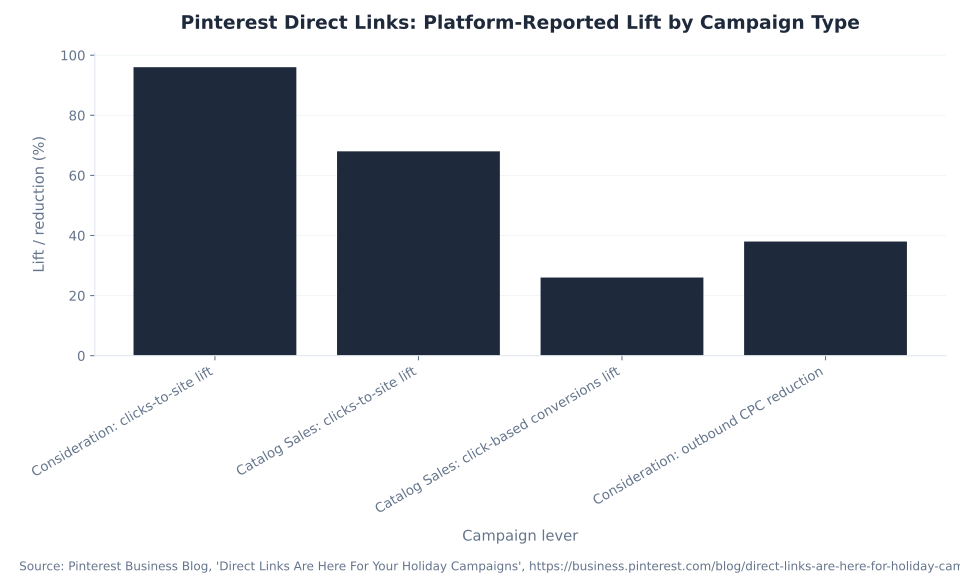
Pinterest reports Direct Links lifted Consideration clicks-to-site by 96% and cut cost-per-outbound-click by 38%, and lifted Catalog Sales clicks-to-site by 68% with a 26% rise in click-based conversions (Pinterest Business Blog, confirmed via Social Media Today) — which is why the CTA conversation has moved from “what phrase” to “which button, matched to which goal.”
The design implication is concrete: leave the bottom of the frame clear for the button, write the in-image phrase to set up the action the button completes, and never bake a competing call-to-action into the picture that contradicts the button label. A Pin that reads “Learn more” in the overlay above a Shop now button sends a mixed signal. Line the button up with your Pinterest campaign objectives so the creative and the goal agree.
Pinterest Video Ad Best Practices: Length, Sound-Off and the Hook
Video on Pinterest is a sound-off, first-second medium — design for the mute button, not against it. Pinterest video should run 6–15 seconds (the platform allows 4 seconds to 15 minutes, but 6–15 sec is the engagement sweet spot), be built vertical or square for the mobile feed, and front-load the hook into the first three seconds, because that is the scroll-stop window (Pinterest, “Review ad specs”; Sprout Social).
The non-negotiable is sound-off design. Video on the feed autoplays muted and the large majority of viewers never turn audio on — vendor estimates put it around 85% (Yans Media, 2026) — so the message has to land through visuals plus on-screen captions, not a voiceover. Pinterest's own framing is that video should communicate without audio.
The practical sequence for a Pinterest video: open on the result in the first frame, hold the hook through second three, demonstrate the product in use, then resolve to a single clear next step. Burn captions in from the first frame rather than relying on Pinterest auto-captions, keep them high-contrast and short, and treat any clip longer than 15 seconds as a tutorial that needs to earn the extra runtime. A muted viewer should understand the whole story on one pass.
| Lever | Best practice | Why it matters |
|---|---|---|
| Length | 6–15 sec (allowed 4 sec–15 min; start near 10 sec) | The feed engagement sweet spot; longer only for tutorials |
| The hook | Front-load the message into the first three seconds; show the result first | The scroll-stop window is brief — a payoff at second 8 is never seen |
| Sound | Design for sound-off; audio is a bonus, never the carrier | Autoplay is muted; the large majority of viewers (around 85%, Yans Media) never enable sound |
| Captions / on-screen text | Burn in captions; high-contrast (4.5:1); short | Carries the message when muted; improves comprehension and accessibility |
| Format / ratio | Vertical (9:16 / 2:3 / 4:5) or square (1:1); max-width for immersive moments | Vertical fills more of the mobile feed; max-width expands across the feed width |
| Content | Product in action or use case; one clear CTA; brand cue early | Demonstrates the benefit and tells the viewer the next step |
Sources: Pinterest Business, “Review ad specs” (video 4 sec–15 min, 6–15 sec recommended; vertical/square ratios; max-width expands across feed), https://help.pinterest.com/en/business/article/pinterest-product-specs; Sprout Social, “Pinterest videos: 2026 best practices” (front-load message in first three seconds; captions for sound-off; 4.5:1 contrast; 6–15 sec sweet spot), https://sproutsocial.com/insights/pinterest-videos/. The ~85% sound-off figure is a vendor characterization (Yans Media), not a Pinterest disclosure.
MB Adv Agency finds the most common video failure is not production quality — it is a great clip whose payoff arrives at second 8, after the viewer has scrolled past. Show the result first, then the product. To read whether the creative is working, see Pinterest ads metrics and ROAS.
Pinterest-Native Creative vs a Repurposed Social Asset
The fastest way to see why Pinterest creative is its own discipline is to put the native build next to the repurposed square asset most brands upload by default. Table 3 contrasts the two across the six levers that decide performance.
| Lever | Pinterest-native creative | Repurposed square / social asset |
|---|---|---|
| Aspect ratio | 2:3 vertical (1000 × 1500 px) — fills the mobile feed | 1:1 square cropped from Meta — occupies less screen |
| Feel | Reads as an idea, inspiration, or helpful suggestion | Reads as a hard advertisement — weaker approval and performance |
| Text | Short, high-contrast overlay that lands one idea | A Meta-style copy block that fights the image |
| Saves | Higher save rate — vertical native creative earns more saves | Lower save rate from a square or landscape crop |
| CTA | Direct Links button matched to the objective, reinforced in-image | No button planned; in-image phrase only |
| Video | Sound-off design, captions, hook in the first three seconds | Voiceover-led clip that fails muted |
Sources: Pinterest Business, “Review ad specs” and “Creative best practices”, https://help.pinterest.com/en/business/article/pinterest-product-specs; https://business.pinterest.com/creative-best-practices/; soona, “Pinterest ad size and specs 2026” (vertical save-rate characterization), https://soona.co/image-resizer/pinterest-image-size-specs.
The column on the left is the whole argument of this pillar in one table: vertical, idea-led, legible, sound-off, button-matched. None of these levers requires a bigger budget or a new production — they are decisions a designer makes in the brief, before a single asset is exported. The repurposed square asset is not wrong because it is low quality; it is wrong because it was built for a different surface and never rebuilt for this one. For the format-by-format detail behind these levers, see Pinterest ad formats.
How to Design a High-Performing Pinterest Ad Creative: The Seven-Step Workflow
This is the order MB Adv Agency works in when designing a Pinterest ad creative from scratch — each step a decision, not a checkbox. Table 4 is the workflow; the same seven steps drive the HowTo schema on this page.
| Step | Action | Why it matters |
|---|---|---|
| 1 | Build a vertical 2:3 canvas (1000 × 1500 px); design native, do not crop a square asset | Vertical fills the mobile feed and earns more saves |
| 2 | Lead with one strong, scroll-stopping visual; for video, front-load the hook into the first three seconds and show the result first | The scroll-stop window is brief |
| 3 | Add a short, high-contrast text overlay (dark on light, 4.5:1, legible at thumbnail size) that lands one idea — keep it out of the bottom edge | Legibility on a muted feed beats completeness |
| 4 | Make branding visible but subtle — a logo or brand cue that does not overtake the creative | Recognition without covering the product |
| 5 | For video, design for sound-off: burn in captions and keep length to 6–15 seconds | Autoplay is muted; most viewers never enable sound |
| 6 | Choose a CTA button matched to your objective (Shop now / Add to cart / Sign up / Learn more) and reinforce it with in-image copy that does not fight it | The Direct Links button is the real CTA |
| 7 | Check the file against Pinterest ad specs (ratio, dimensions, file size, type, character limits) before upload; build 2–3 variations to test | Specs change; variations find the winner |
Sources: Pinterest Business, “Review ad specs” and “Creative best practices”, https://help.pinterest.com/en/business/article/pinterest-product-specs; https://business.pinterest.com/creative-best-practices/; Sprout Social, “Pinterest videos: 2026 best practices”, https://sproutsocial.com/insights/pinterest-videos/. Workflow framing is MB Adv Agency practitioner guidance; the underlying specs are Pinterest-attributed.
Run the workflow once and the file ships native, legible, and button-matched. To track whether the design changes move CTR, saves, and ROAS, see Pinterest ads metrics and ROAS, or talk to our team about building a repeatable creative system.
Pinterest Creative Strategy
Designing pins for fashion, home decor, beauty, or food? The vertical canvas is just the start.
The brands that win on Pinterest pair a vertical-first creative system with legible overlays, sound-off video, and a CTA button matched to the objective. See how MB Adv Agency approaches Pinterest creative for fashion, home decor, beauty, and food & beverage brands.
Explore fashion PPC services →AI Creative and Performance+: What the Machine Designs for You
Two 2026 realities reshape the “design the Pin” equation for catalog-fed formats. First, Shopping and Collections ads are catalog-generated — Pinterest builds the creative from your product feed with live price and availability, so designing those formats is really about feed image quality and the hero asset, which is the job of Pinterest shopping ads and catalogs.
Second, Pinterest Performance+ creative now AI-generates backgrounds and creative variations for catalog ads (Pinterest, “Pinterest Performance+”). The reported figures below are Pinterest-attributed from internal testing.
| Feature / cohort | Pinterest-reported figure |
|---|---|
| AI backgrounds: conversion rate lift | +11% CVR in Pinterest internal testing |
| Walgreens early test | +55% CTR / −13% CPC vs white backgrounds (single-brand test) |
| Performance+ creative adopters | +19% checkout revenue attributed to Pinterest ads |
Source: Pinterest Business, “Pinterest Performance+” product page, https://business.pinterest.com/performance-plus-ads/. The Walgreens figure is a single-brand early test, not a generalizable benchmark; the +19% checkout-revenue figure applies to Performance+ creative adopters broadly. All figures are Pinterest internal testing, not MB Adv Agency client data.
The honest framing for a creative pillar: AI handles the variation and background grunt-work, but the human decisions that move the needle — the hook, the overlay legibility, the value proposition, the CTA match — are exactly what this page teaches. The AI raises the floor; it does not replace the craft. For the deeper automation and bidding work, see Pinterest ads optimization and AI.
Building the Vertical 2:3 Canvas
The vertical canvas is the foundation every other creative decision sits on. Design the master at 1000 × 1500 px and treat the full 2:3 frame as working space, not the cropped center of a wider composition. The product or idea should occupy the upper two-thirds, where the eye lands first in a vertical scroll, and the lower third should stay clean — both because the Direct Links button renders there and because breathing room reads as the “inspiration” tone Pinterest rewards.
For home decor PPC and photography PPC brands, where the image is the product, the vertical frame is a gift: a styled room or a portrait fills the canvas with no wasted space. MB Adv Agency rebuilds rather than crops — a square hero gets reshot or re-composed vertical, not letterboxed — because a cropped asset signals “repurposed” to both the algorithm and the eye.
The First-Frame Hook
Whether the asset is static or video, the first frame does the heavy lifting. A static Pin gets one frame to land the idea; a video gets three seconds before the scroll decides. Front-load the payoff: show the finished room, the plated dish, the wedding tablescape — the result — and let the process or the product detail follow.
For food & beverage PPC and wedding PPC brands whose creative is a transformation or a reveal, the temptation is to build to a climax. On Pinterest that is backwards. Open on the climax, then earn the watch-through. The single most common reason a strong clip underperforms is a payoff that arrives after the viewer has already moved on.
Branding Without Overpowering the Creative
Branding on a Pin is a presence question, not a size question. The logo and brand cue should be clearly visible and consistent across a set, but subtle — a corner mark or a restrained wordmark, never a banner that covers the product. Pinterest's guidance is explicit that the logo should be visible but not overpowering, and that the ad should feel like an idea, not a billboard.
For beauty products PPC brands building a recognizable shelf identity, consistency across the creative set matters more than logo size on any single Pin: the same type treatment, palette, and composition rhythm train recognition over a campaign. To read whether that recognition is converting into saves, clicks, and ROAS, see Pinterest ads metrics and ROAS.
Frequently Asked Questions: Designing Pins for Pinterest Ads
What size should a Pinterest ad be?
The recommended size for a standard Pinterest ad image is a 2:3 vertical ratio at 1000 × 1500 px, saved as PNG or JPEG. That vertical canvas fills the most space in the mobile feed, where most Pinterest browsing happens, and it earns more saves than a square or landscape crop. The desktop upload limit is 20 MB; the in-app upload limit is 32 MB. Carousel cards follow the same 1:1 or 2:3 ratios at 20 MB per card, with two to five linkable cards. Idea ads use a taller 9:16 ratio at 1080 × 1920 px. Video ads accept square 1:1 or vertical 2:3, 4:5, or 9:16, up to 2 GB. Always confirm the current numbers against Pinterest’s live “Review ad specs” page before you upload, because Pinterest revises these specifications often and the feed truncates anything taller than the recommended ratio.
How do I use text overlays on a Pinterest Pin?
Use a Pinterest text overlay to land one idea at a glance, not to explain the product. Write a short phrase — “Get the recipe,” “Small-space sofa” — in a high-contrast treatment, dark text on a light area of the image, sized to read at thumbnail scale on a muted feed. Aim for a 4.5:1 contrast ratio, the accessibility standard Sprout Social cites for on-screen text. Place the overlay at the top or center of the frame and keep it clear of the bottom edge, where the Direct Links call-to-action button renders and cannot be disabled on eligible campaigns. Keep the brand cue visible but subtle so it does not cover the product. For Idea ads, stay under the 250-character per-page overlay cap and chunk longer copy across pages. The overlay is legibility design first and copywriting second — short, contrasting, and positioned away from the button.
How much text should be on a Pinterest ad?
Keep on-image text minimal. Pinterest’s creative guidance is a short phrase that communicates the value at thumbnail size — one idea, not a paragraph. A crowded, text-heavy, sales-y image hurts both ad approval and performance, because it reads as a hard advertisement rather than the inspiration Pinterest users browse for. The image carries the message; the overlay names the idea. Concretely: one headline phrase, optionally one short supporting line, and a brand cue. Drop the feature list, the multiple competing headlines, and the wall of body copy. On Idea ads, the overlay cap is 250 characters per page, which is a useful ceiling in itself. When the value proposition needs more than a phrase to explain, the fix is a stronger visual or a video that demonstrates it — not more text crammed onto a static Pin. Legibility on a muted mobile feed beats completeness every time.
What is the best CTA for Pinterest ads?
The best Pinterest CTA is the system call-to-action button matched to your conversion event, reinforced by in-image copy that does not fight it. On eligible Consideration, Conversion, and Catalog Sales campaigns, Direct Links render a CTA button below the creative by default, and that button cannot be disabled. It defaults to “Learn more” for standard ads and “Shop now” for shopping ads, with objective-matched alternatives including Add to cart, Sign up, Register now, Get offer, and Get recipe. Match the button to the action: Add to cart for a cart campaign, Sign up for a lead campaign, Shop now for catalog sales. Then let the in-image phrase reinforce it — “Shop the look” above a Shop now button, “Join free” above Sign up. Pinterest reports Direct Links lifted Consideration clicks-to-site 96% and cut cost-per-outbound-click 38%, which is why the button outweighs the baked-in phrase.
How long should a Pinterest video ad be?
Pinterest video ads run their best at 6 to 15 seconds. The platform allows anything from 4 seconds to 15 minutes, but the 6-to-15-second window is the feed engagement sweet spot, and starting near 10 seconds is a sound default. Longer durations earn their place only for genuine tutorials and step-by-step Idea ads. The reason short wins is the scroll: front-load the message into the first three seconds and show the result first, because a payoff that arrives at second 8 is never seen. Build the video vertical — 9:16, 2:3, or 4:5 — or square at 1:1 so it fills the mobile feed, and keep the file under the 2 GB limit. Sprout Social confirms the 6-to-15-second sweet spot and the first-three-seconds hook for 2026. Treat length as a discipline: the shorter you can land the idea, the more of your audience absorbs it.
Do Pinterest video ads need sound?
No. Design Pinterest video for sound-off. Video autoplays muted in the feed, and the large majority of viewers — vendor estimates put it around 85%, per Yans Media — never enable audio. A voiceover-dependent video fails to communicate. The message has to carry through visuals and on-screen captions, with audio as a bonus layer rather than the carrier. Burn in short, high-contrast captions at a 4.5:1 contrast ratio so the story lands silently, and keep the key information out of the frame’s bottom edge where the CTA button sits. Sprout Social’s 2026 guidance is explicit that Pinterest video is consumed with audio off and that captions are essential. The practical test our team uses: mute the clip and watch it once — if the idea does not land without sound, the video is not finished. Sound enhances a Pinterest video; it never rescues one.
Need a creative system, not just a one-off Pin?
Talk to our team about Pinterest creative for your brand.
Vertical templates, overlay rules, CTA-to-objective mapping, and sound-off video that performs instead of just looking nice — MB Adv Agency helps visual-discovery brands build a Pinterest creative system that holds up across a whole campaign.
Get in touch →Methodology and Sources
This pillar draws on four inputs: Pinterest's own help documentation (“Review ad specs,” “Creative best practices,” “Use direct links in your ads,” “Calls to action,” and the Performance+ product page); Sprout Social's 2026 Pinterest video best-practices guide for length, sound-off, hook, and contrast; soona's 2026 Pinterest ad size and specs guide for dimensions and the vertical save-rate characterization; and Yans Media's 2026 specs guide for the vendor sound-off estimate. All spec figures are Pinterest-attributed and subject to change — verify every cell against the live “Review ad specs” page at publish. Performance figures (Direct Links lift, Performance+ creative lift, sound-off share, 4.5:1 contrast) are Pinterest-reported or vendor-attributed inline. No MB Adv Agency client metrics are cited; all MB Adv attributions are qualitative practitioner observations. Web-verified June 2026.
Pinterest has emerged as a crucial platform for businesses looking to engage visually and capture the attention of their audience. With over 450 million monthly active users, the potential to reach new customers and drive traffic to your website is significant. However, to stand out in a crowded space, designing effective pins for Pinterest ads is essential. This article will delve into optimal image sizes, tips for creating visually appealing pins, and useful tools for pin design.
Optimal image sizes and formats
One of the fundamental aspects of designing pins for Pinterest ads is understanding the optimal image sizes and formats to use. Pinterest is a visual platform, and the format of your images can significantly influence how users interact with your content.
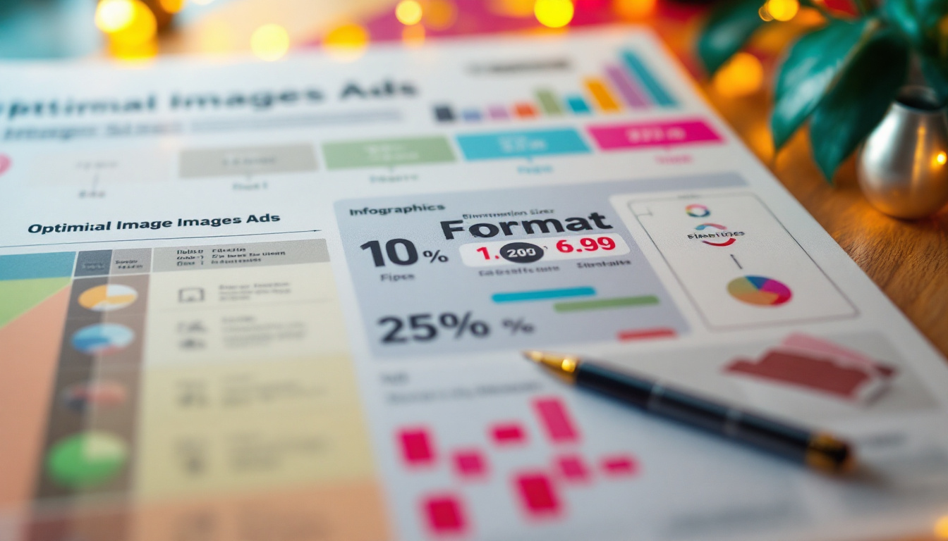
The recommended size for Pinterest pins is 1000 x 1500 pixels, which maintains a 2:3 ratio. This aspect ratio not only displays well on desktops but also looks great on mobile devices, which constitute a large portion of Pinterest users. Keeping within this size range ensures your images won't be cropped and will appear in their full glory. Additionally, using high-resolution images can enhance the overall aesthetic of your pins, making them more appealing and professional. It’s worth noting that images with a bit of whitespace can also draw the eye and create a sense of balance, making your content stand out even more in a crowded feed.
Besides the dimensions, the format of your images matters too. Pinterest supports a variety of image formats, but JPEG and PNG are the most commonly used. JPEG is great for photographs and images with complex color schemes, while PNG works well for images that require transparency or those with text overlays. Furthermore, GIFs can also be utilized for animated pins, adding an engaging element that can capture attention quickly. However, it’s important to ensure that any animation is subtle and not overwhelming, as the goal is to complement the content rather than distract from it.
It's also essential to consider the file size. Keeping your images under 20MB ensures faster loading times and better user experience. High-quality images that load quickly will capture the attention of users more effectively, which is precisely what you want for your advertising efforts. Remember that Pinterest compresses images upon upload, so starting with a high-quality file can help maintain visual integrity after compression.
Image aspect ratios
While the 2:3 aspect ratio is the gold standard for standard pins, Pinterest has expanded its offerings with video pins and carousel pins. For video content, a 1:1 ratio can work effectively, particularly if you are looking to create mobile-friendly content. Carousel pins, which allow multiple images in a single post, can also follow the 2:3 ratio to remain consistent with standard pin sizes. Additionally, experimenting with the new Idea Pins feature can provide more interactive content opportunities, allowing for a combination of images, videos, and text in a single post, further enhancing user engagement.
By understanding these various formats and ratios, advertisers can tailor their visual content to fit seamlessly within Pinterest’s established guidelines while optimizing for performance across devices. Keeping an eye on these specifications is the key to a successful campaign. It’s also beneficial to stay updated with any changes Pinterest may make to their platform, as adapting to new features or guidelines can give your content a competitive edge.
Testing different formats
Given the diversity of Pinterest users and their varying preferences, it's crucial to test different formats and sizes. Conduct A/B testing by creating multiple versions of your pins with different sizes and formats. Monitor which pins receive the most engagement—clicks, saves, and shares. Based on this analysis, you can refine your image choices for optimal results. It’s also valuable to pay attention to the time of day and seasonality when analyzing engagement, as certain styles or themes may resonate more during specific times of the year.
This iterative approach not only enhances your ad strategy but helps you stay versatile and adaptable in a dynamic online marketplace. By continually experimenting and analyzing results, you can discover trends that resonate with your audience and leverage those insights to create even more compelling content. Engaging with your audience through comments and feedback can also provide additional perspectives on what types of visuals they find most appealing, further guiding your creative process.
Tips for creating visually appealing pins
Once you have the optimal sizes and formats down, the next step is to focus on making your pins visually appealing. A visually compelling pin is more likely to attract attention and encourage users to click through to your website. Here are some tips to enhance your pin design:
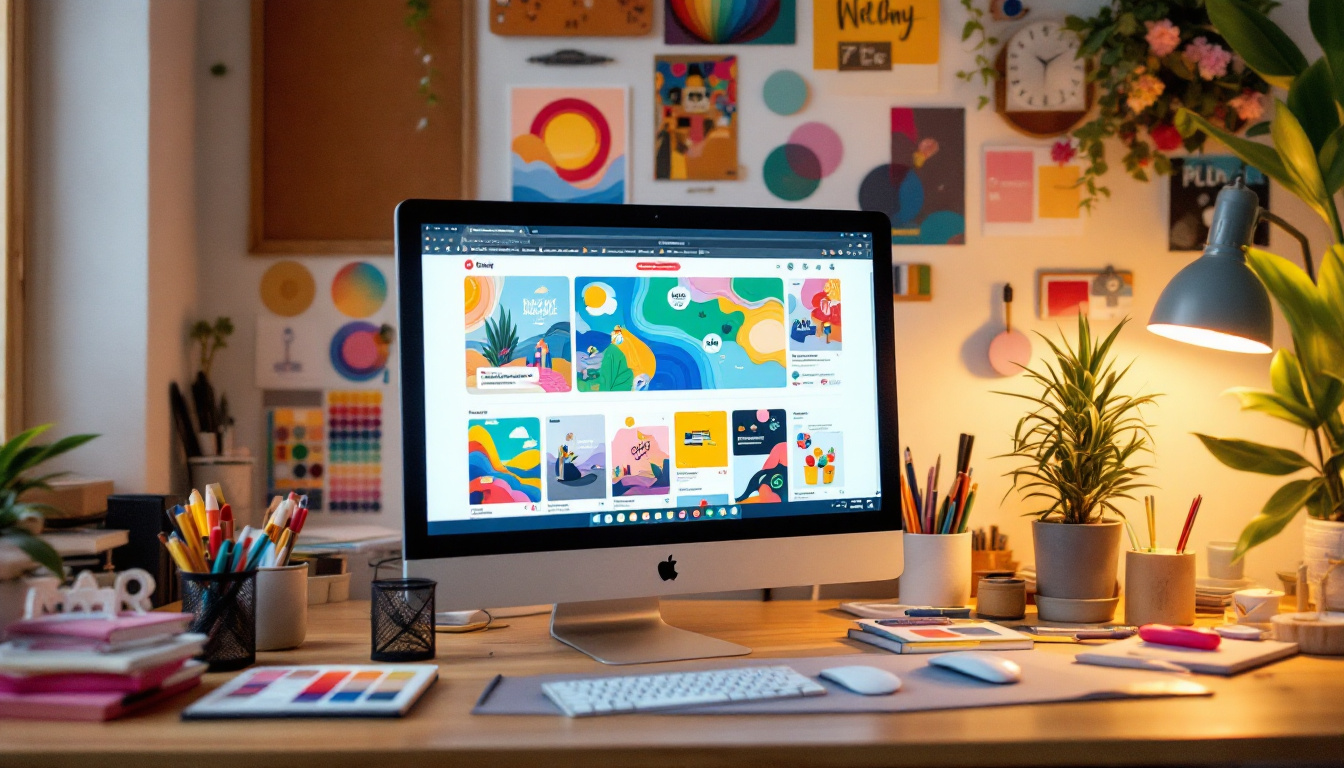
- Use high-quality images: Always choose crisp, high-resolution images. Blurry or pixelated images can instantly turn users away.
- Incorporate readable text: If you’re adding text, ensure it’s legible. Use contrasting colors for text and background, and avoid overly complicated fonts that may be hard to read.
- Branding consistency: Use consistent colors, logos, and styles that reflect your brand identity. This builds recognition and trust over time.
Additionally, it's beneficial to consider the psychological aspects of color in your designs. Colors evoke emotions and can influence user behavior. For instance, using warm color palettes can create a sense of excitement, while cool tones can evoke calmness, making them effective depending on the message you want to convey. Furthermore, experimenting with color combinations can lead to unique and eye-catching designs that stand out in a crowded feed. Consider using tools like Adobe Color or Canva’s color palette generator to find the perfect hues that resonate with your audience.
Focusing on the message
Another key aspect is ensuring that the message of your pin is clear and concise. Users are scrolling through a plethora of content, and you have only a fleeting moment to capture their interest. Use a bold headline that summarizes what your pin is about.
A good practice is to put the most critical information upfront. If your pin is for a blog post, include the post's title right on the image. This way, even if users don't click through, they can still grasp valuable information. Additionally, consider using bullet points or short phrases to break down complex ideas into digestible snippets, making it easier for viewers to understand your message at a glance. This approach not only enhances readability but also encourages users to engage further with your content.
Remember, the overall goal is to create a visual narrative that draws users in while clearly communicating what you’re offering. Strive for a balance between beautiful visuals and effective communication. Incorporating storytelling elements into your designs can also help to create a deeper connection with your audience, making your pins more memorable.
Encouraging action
Lastly, don’t forget to include a call-to-action (CTA). Phrases like “Shop Now”, “Learn More”, or “Get the Look” can significantly increase the likelihood of user engagement. Place the CTA strategically within the design but ensure it doesn’t overshadow the main content of the pin.
Effective CTAs paired with engaging visuals can guide users towards the next step in their customer journey, ultimately leading to better conversion rates. To further enhance the effectiveness of your CTAs, consider using action-oriented language that creates a sense of urgency or exclusivity, such as “Limited Time Offer” or “Join the Community Today.” This can motivate users to take immediate action, turning casual browsers into loyal customers. Additionally, testing different CTA placements and styles can provide insights into what resonates best with your audience, allowing you to refine your approach over time.
Tools for pin design
Designing visually appealing pins requires not just creativity but also the right tools. There are several excellent resources available that can simplify the process of creating standout content for Pinterest ads. Here are some noteworthy tools to consider:
- Canva: This user-friendly design software offers a plethora of templates specifically tailored for Pinterest. You can easily customize these templates to align with your brand's aesthetics.
- Adobe Spark: With powerful editing features, Adobe Spark allows users to create professional-quality visuals with minimal effort. It offers templates and an extensive library of images and icons.
- Piktochart: Mainly designed for infographics, Piktochart allows you to present information creatively. Infographics can serve as engaging pins that inform while enticing users to explore more.
While these tools provide innovative design pathways, remember that the essence of your pins should reflect your brand's values and goals. Embrace simplicity and clarity, ensuring your design choices resonate with your audience.
Choosing the right tool for your needs
Take the time to explore each of these tools and determine which best fits your specific needs. Whether you’re looking for ease of use, template variety, or advanced editing capabilities, there’s a tool out there suited for your design approach.
Experiment with different platforms and find what allows you to express your creativity while producing high-quality visuals efficiently.
Continuous learning and adaptation
Design trends evolve, and so do user preferences, necessitating a commitment to continuous learning. Regularly update your skills and stay informed about the latest design trends in the marketing landscape. Engaging with design communities online can also provide inspiration and insights that will fuel your creative process.
As Pinterest continues to grow and change, so too should your approach to designing pins. Embrace flexibility and be willing to adapt—your ability to respond to trends could be the key to your advertising success on Pinterest.
In conclusion, effective pin design is crucial for maximizing engagement and driving traffic through Pinterest ads. By following the recommended image sizes, creating visually compelling and clear content, and utilizing the right design tools, you'll be well on your way to captivating your target audience and enhancing your advertising performance.

As a Google Ads expert, I bring proven expertise in optimizing advertising campaigns to maximize ROI.
I specialize in sharing advanced strategies and targeted tips to refine Google Ads campaign management.
Committed to staying ahead of the latest trends and algorithms, I ensure that my clients receive cutting-edge solutions.
My passion for digital marketing and my ability to interpret data for strategic insights enable me to offer high-level consulting that aims to exceed expectations.
Google Partner Agency
We're a certified Google Partner Agency, which means we don’t guess — we optimize withGoogle’s full toolkit and insider support.
Your campaigns get pro-level execution, backed by real expertise (not theory).

4.9 out of 5 from 670+ reviews on Fiverr.
That’s not luck, that’s performance.
Highly recommend Matteo to set up your server side tracking. He has a deep understanding of e-commerce tracking and will go above and beyond to make sure everything is set up correctly and working 100%. If you are scaling your store this set up is non-negotiable in my opinion and there isn't many people who have this much knowledge or put the effort in to get it right. Thanks again!
avorodesign.com
I can only recommend Matteo! He was very patient, professional and very knowledgeable about GA4, Consent Mode v2, and GDPR compliance. Communication was clear, and the setup was done professionally and efficiently. Highly recommend him for anyone needing reliable tracking implementation.
www.natureiki.life
Matteo shines in the realm of online professionals. His work is not only deep in data but also complemented by his proactive communication and cooperation, setting a new standard for freelancers. If you want someone who truly exceeds expectations, look no further. Highly recommended!

www.omanbeverlysmyth.com
Exceptional Service Beyond Expectations - Outstanding Service Impeccable depth, flawless delivery, and exceptional language fluency—this service exceeded all expectations. Highly recommended. Matteo truly ROCKS!!!
ium-paris.com
Top-notch, always highly value working with Matteo. An absolute Google Ads Genius. This is approximately the 8th time I have hired him and he's helped us get 6-7 ROAS. We are excited in continuing to improve our lead flow. Hire this guy if you need Google Ads help. Thanks Matteo!
www.dleeventgroup.com
I finally found the guy who can setup server side tracking and all the ecosystem properly. I definitely recommend Matteo. He is very responsive, kind and wants to dig into things. He configured GA4, Meta, Google Ads, Outbrain and google consent v2 with Cookiebot. Thanks Matteo.

inomega.fr
MB Adv delivered exceptional work with outstanding professionalism and lots of patience, taking time to see effects of changes made and not just do the work and submit it. The proactive communication and video summaries of the work completed made working with Matteo a pleasure, as he consistently went above and beyond. Highly recommended for web analytics projects! We are already working on another project.

www.withnellsensors.co.uk
Working with Matteo on my Google Ads was a game-changer. He's not just a strategist, he's a true partner. He understood my goals and tailored a campaign that perfectly reached my target audience. I'm grateful for his expertise and dedication.

dccargo.com
Click-driven mind
with plastic-brick obsession.
We build Google Ads campaigns with the same mindset we use to build tiny brick worlds: strategy, patience, and zero tolerance for wasted pieces.
Data is our blueprint. Growth is the only acceptable outcome.